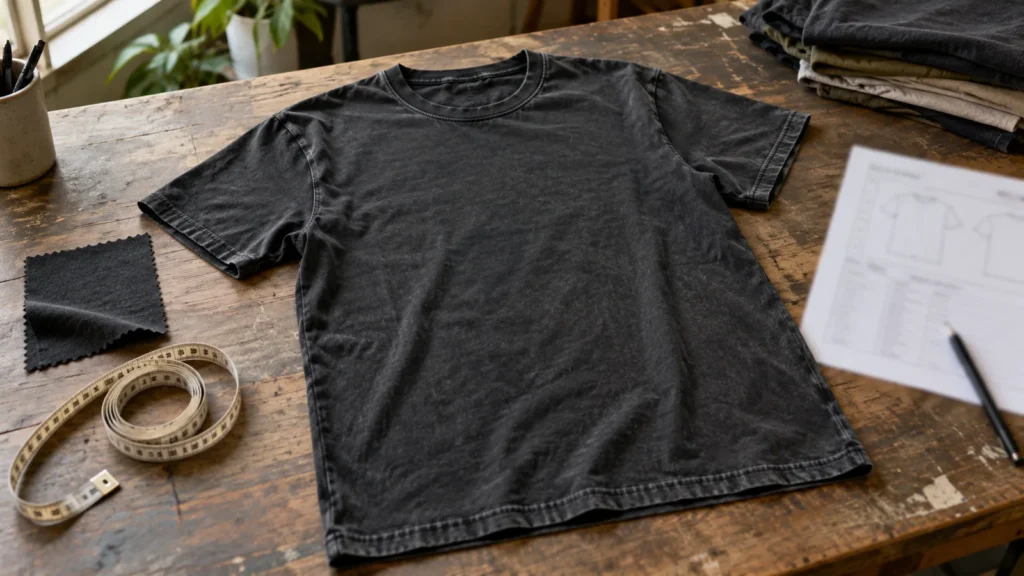
A good vintage T-shirt should look worn-in, not simply damaged. A faded black tee with a soft hand and restrained graphic feels different from a crisp, heavyweight boxy shirt given the same wash. The question is which combination of fabric, shape, color, print and finish supports your reference.
For a clothing brand, that distinction matters before a wash facility touches the first sample. Random fading can weaken a neckline, distort a graphic or produce an inconsistent shade. A repeatable effect starts with a design brief, then moves through fabric and fit selection, controlled processing, testing and an approved reference. This guide focuses on professional garment development rather than risky at-home chemical experiments.
What Makes a T-Shirt Look Vintage?
A vintage T-shirt usually combines some of these signals: softened or faded color, a worn-in surface, an older-style silhouette, an aged-looking graphic and a hand feel that is less crisp than a new blank. It does not need every signal at once. A clean garment-dyed tee may look convincingly old through color and shape alone, while a concert-inspired graphic tee may rely more on artwork and print texture.
The useful question is not “How much can we distress it?” but “What should look aged, and what must remain sound?” Neck rib, seams, measurements and print legibility still have to serve the product. The best effect is coherent enough that the shirt looks intentionally developed rather than randomly worn out.
How to Create a Vintage T-Shirt Step by Step
1. Define the Vintage Reference Before Choosing the Fabric
Start with a specific visual direction. A 1970s athletic tee, a 1980s concert-style shirt, a 1990s oversized graphic tee and a minimal washed streetwear blank do not share one fit or finish. Gather references for silhouette, neckline, color, print and wear without copying another brand’s artwork.
Translate references into decisions a sample team can evaluate. Is the target light and soft, or structured and boxy? Should the graphic appear newly printed or aged with the garment? Define what must be consistent and where variation is acceptable. Washing first often produces a sample that does not belong in the intended collection.
2. Choose the Right T-Shirt Fabric
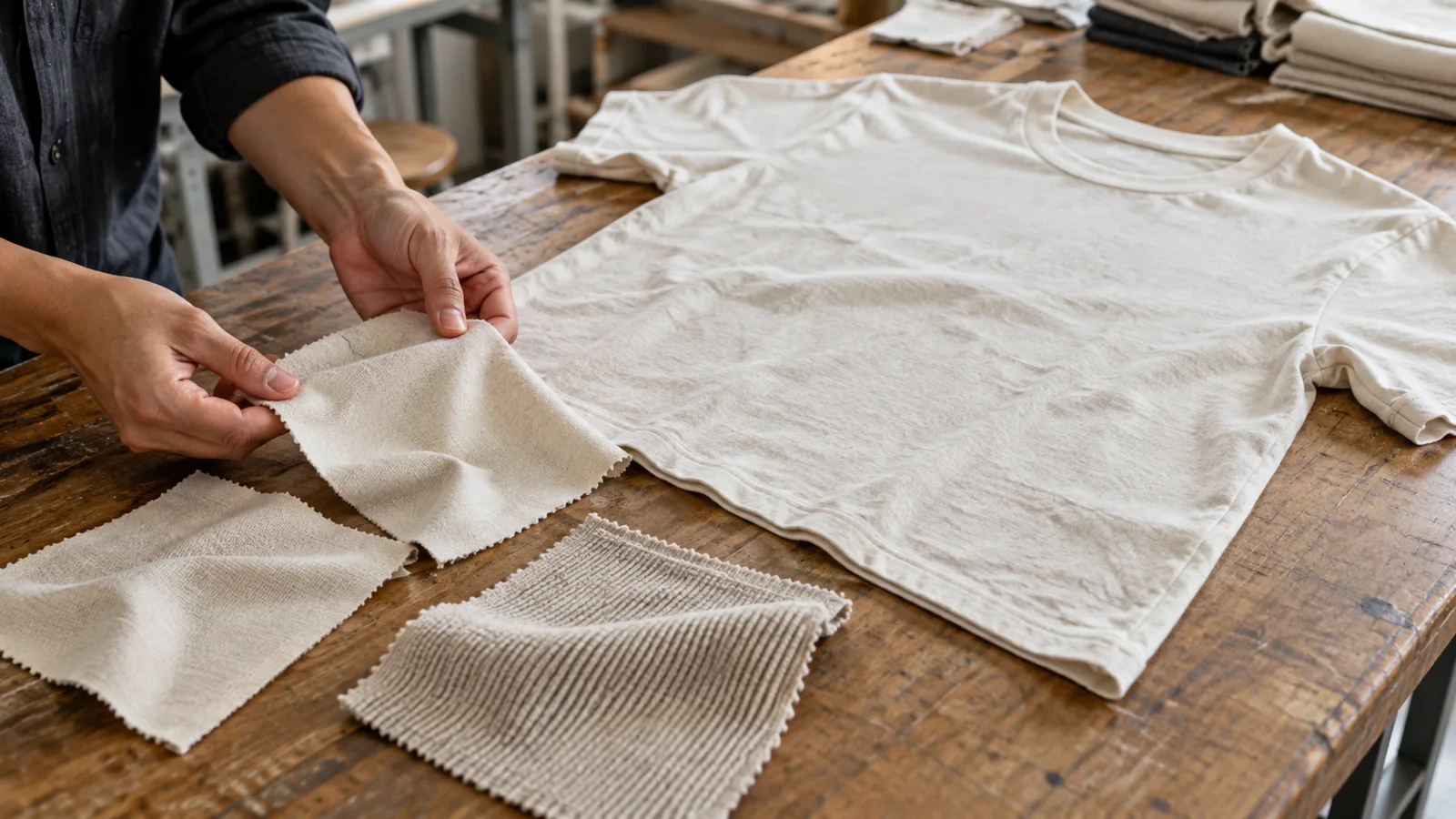
Fabric sets the limits for everything that follows. The CottonWorks guide to single and double knits identifies single jersey as a common T-shirt construction and explains how fiber, yarn and knit choices affect the resulting material. Cotton jersey, cotton-rich blends, lighter soft jerseys and heavier structured jerseys can all support a vintage direction; none is the universal vintage standard.
A lightweight fabric may drape and soften for a close-fitting retro tee. A heavier one may hold a boxier silhouette. Texture also changes how ink sits on the shirt. Compare physical swatches and trial garments before selecting a wash or print. The separate T-shirt fabric options and fabric-weight guide help with those decisions; GSM alone cannot determine the vintage result.
3. Decide Whether You Want a Soft or Structured Vintage Fit
“Vintage” is not a size specification. A trim athletic shape, a regular classic tee, a short boxy body and an oversized streetwear silhouette can all communicate different periods or references. Specify body width, body length, shoulder position, sleeve length and neck rib rather than instructing a factory to make the shirt “more vintage.”
Review fit after finishing. A soft wash cannot fix a body patterned too long or a disproportionate sleeve. A larger label size is no substitute for a drafted oversized fit. The US shirt size guide explains why S–XL labels alone cannot define measurements. Approve fit on the washed sample, not just an untreated blank.
4. Create the Base Color Before Adding Wear
Color often does more work than holes or frayed edges. Washed black, muted navy, soft cream and faded earth tones can suggest age while leaving the garment structurally clean. A garment-dyed or pigment-dyed appearance can also be part of the direction, but the exact coloration process and its compatibility with the chosen fabric must be confirmed with the dye facility.
Judge the base shade beside the artwork and trims. A bright ground and broken graphic may work as deliberate contrast, but not by accident. Record a color reference under consistent lighting. For irregular wash-down, define an acceptable range rather than expecting identical garments.
5. Use Controlled Washing to Develop a Worn-In Surface
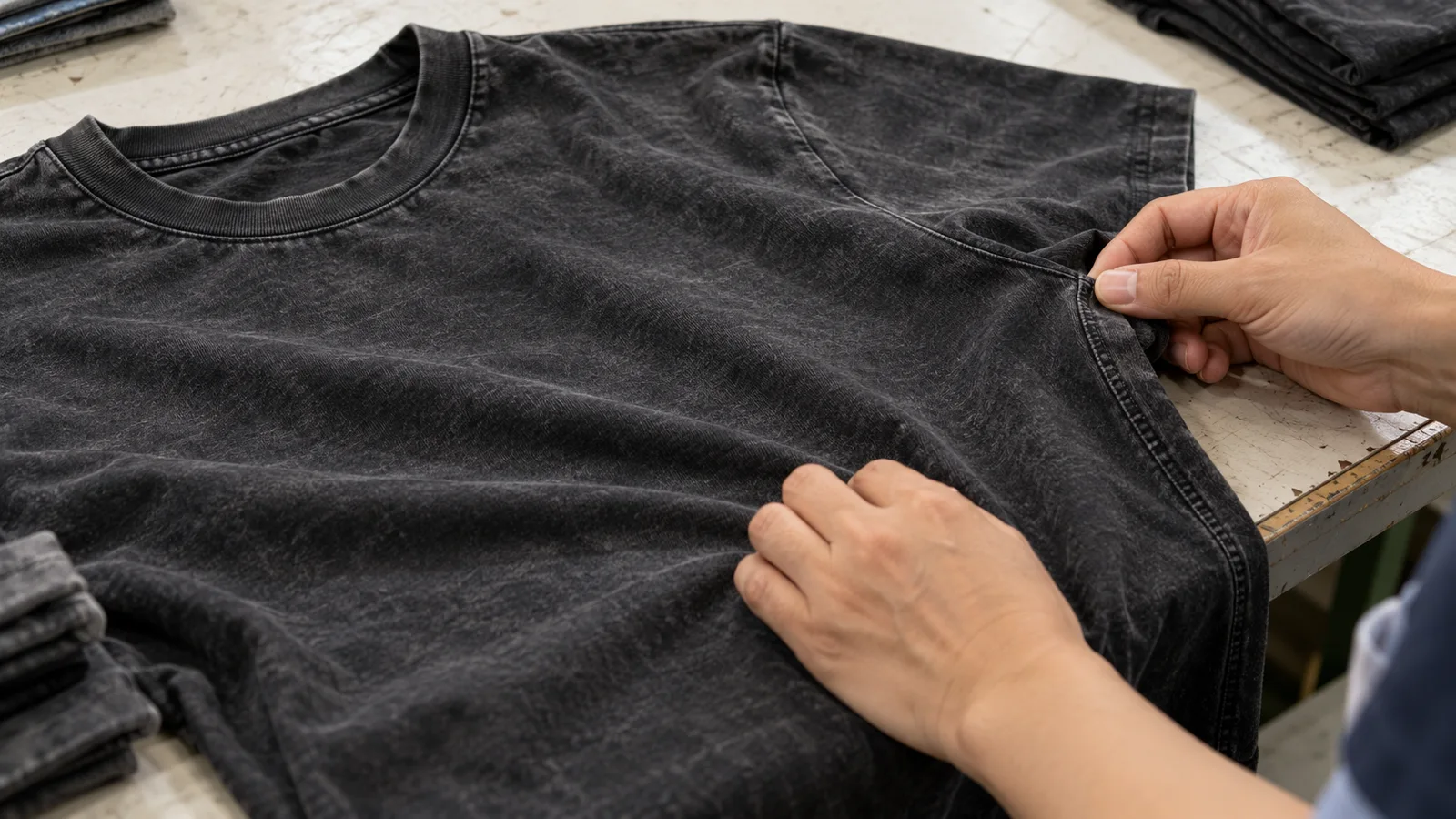
Professional garment washing can soften the hand, change surface character and create a controlled fade. Depending on the product, a qualified facility might explore softening, enzyme-assisted finishing, pigment wash or carefully managed abrasion. These are development directions, not interchangeable recipes. CottonWorks’ finishing guidance explains that finishing can change appearance, hand and serviceability, while its shrinkage and skewing guidance connects wet processing and finishing choices to dimensional stability.
Evaluate shade, hand, seams, twist, shrinkage and consistency together. A dramatic fade fails if the side seam twists or length changes excessively. Qualified mills or wash facilities must develop and test the process for the specific garment. This guide provides no chemical concentrations, timings or household bleach instructions.
6. Build the Vintage Look Into the Print Artwork
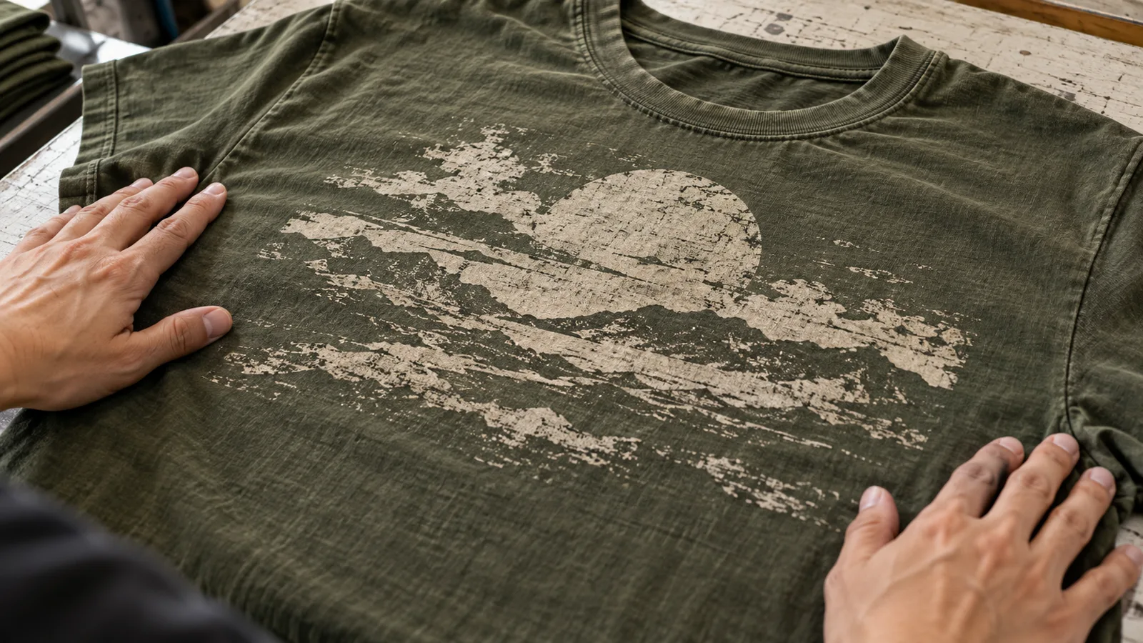
The shirt itself does not have to be heavily distressed for a graphic to feel old. Distressed texture, halftone, reduced ink coverage, softened edges and a limited color palette can be designed into the artwork file. A large solid block of ink will read differently from a thin-line drawing; each needs its own approach to aging and legibility.
Design distress instead of randomly scraping a finished print. Keep important details readable; avoid evenly scattered digital noise. Decide whether the print should contrast with the washed fabric or fade with it. Approve a print sample on the actual fabric, since the same file changes with knit texture. Use original or licensed imagery.
7. Choose a Print Method That Matches the Vintage Effect
Screen printing, direct-to-garment (DTG) and direct-to-film (DTF) can create different surface looks and hand feels, but none automatically makes a print vintage. Ink coverage, substrate, pretreatment, artwork and the sequence of printing and washing all matter. A soft, broken graphic may be easier to achieve through artwork and controlled coverage than by forcing a method to fail.
Brother’s DTG substrate guidance notes that, in its equipment and ink context, a properly printed tri-blend can show a washed-out appearance. That is a useful possibility to test, not a promise that every DTG print on a blend will look vintage or remain durable. If considering transfer printing, the separate DTF cotton-versus-polyester guide covers material compatibility. For this project, compare printed samples before and after the proposed wash and care cycle, then approve the combination rather than a print method in isolation.
8. Add Distressing Only Where It Supports the Design
Distressing can appear at the collar, sleeve edge, hem, print or garment surface. The location should make sense for the reference. A barely faded minimal blank may need no physical damage; a concert-inspired tee may tolerate a visibly worn print and modest edge wear. Applying every effect at full strength usually makes the shirt look staged.
Use controlled factory-developed abrasion or pre-designed print distress where appropriate, and inspect what it does to construction. A weakened collar can lose recovery; a nick near a seam can become a failure point; excessive surface wear can shorten the shirt’s useful life. Evaluate any intentional damage against the brand’s durability requirements and approved sample. “Authentic-looking” should describe the visual result, not an excuse for avoidable quality defects.
9. Test the Garment After Washing and Printing
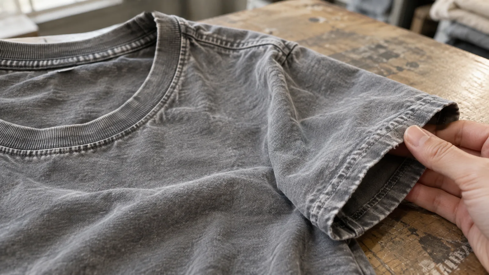
The final sequence matters. Assess the garment after the chosen coloration, wash and print combination, then test it again under expected care. AATCC TM61 addresses laundering colorfastness; AATCC TM150-2025 addresses garment length and width changes after home laundering; and AATCC TM143 addresses the appearance of seams and textile products after home laundering. These methods offer distinct checks, not one universal “vintage quality” score.
Review color change, print appearance, shrinkage, twisting, seam smoothness, neck recovery and hand feel. Test the actual production-intent fabric and treatment rather than relying on a different blank. The brand and relevant market should set methods and acceptance criteria for the project; this article does not invent pass/fail numbers. A vintage finish can include controlled visual variation, but unintended color transfer, severe size change or seam failure should not be passed off as character.
10. Approve a Vintage Standard Before Bulk Production
An instruction such as “make it look older” leaves too much open to interpretation. Keep an approved physical sample, wash-shade reference, print-distress reference, hand-feel expectation and final garment measurements. Record the agreed range of acceptable variation and the order of operations. If the wash is applied after printing, for example, the team needs to know that the approved print was evaluated after that sequence.
Review a size set and production-intent sample, not only a single attractive development piece. Confirm that labels, rib, seams and trims still work with the finish. Then use the approved sample as the reference for the wash facility, printer and garment team. A vintage T-shirt can look irregular, but a commercial run still needs a controlled boundary between intentional variation and rejectable defects.
What Is the Difference Between Vintage Wash, Acid Wash and Garment Dye?
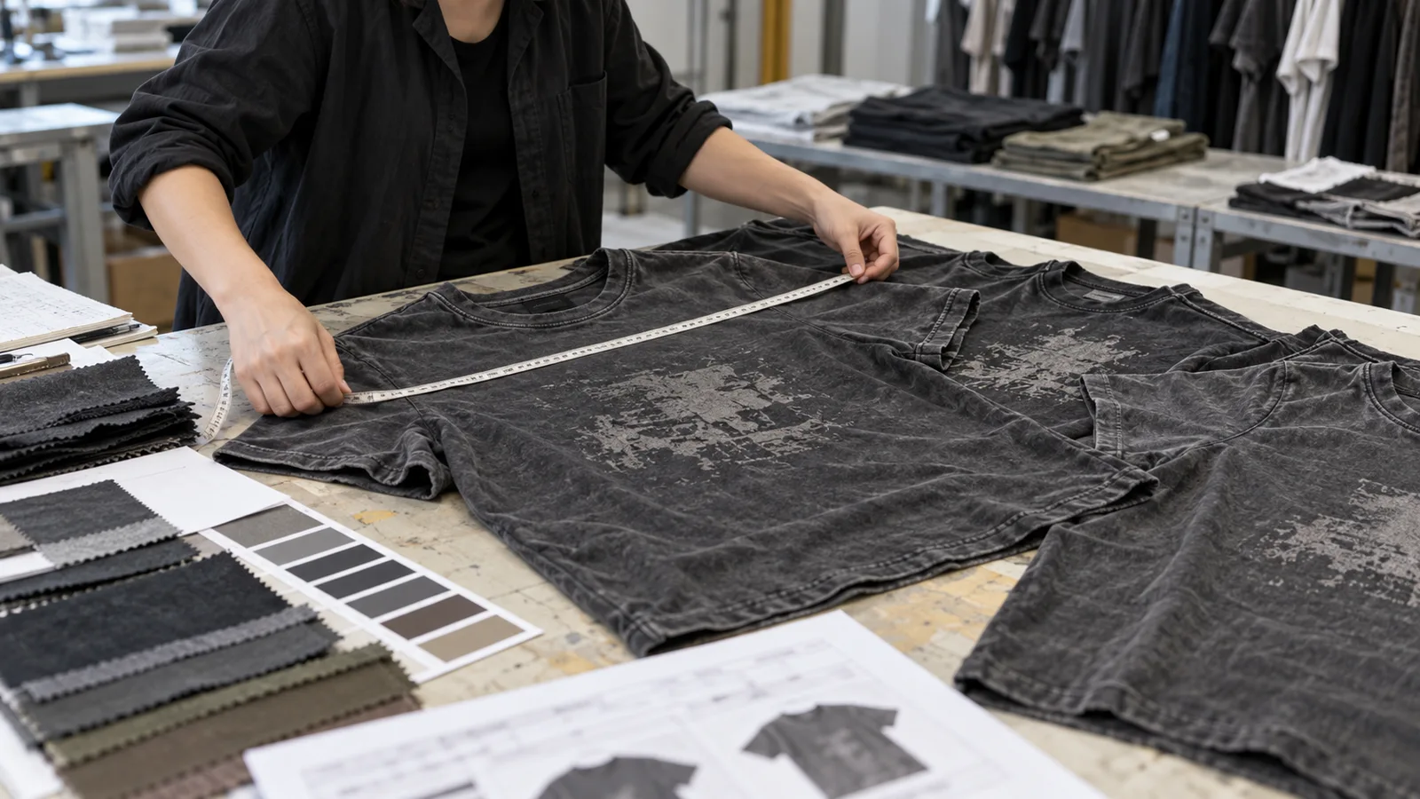
These terms describe different things. “Vintage wash” is an appearance goal, not one standardized process. “Acid wash” refers to a higher-contrast mottled aesthetic and a family of industrial approaches whose methods vary by material and facility. Neither term supplies a production recipe.
Garment dye means coloring a sewn garment rather than cutting it from pre-dyed fabric. It can look vintage but does not guarantee fading, softness or an aged print. The order of coloration, printing and finishing changes the result. Specify appearance and develop samples with a qualified facility instead of treating these names as interchangeable instructions.
How Do You Make a Vintage Print Look Natural?
Start with the artwork’s visual hierarchy. Distress should respect the scale of the graphic, the amount of ink and the way the fabric texture shows through. A broad solid shape can tolerate areas of missing coverage; a fine-line illustration may lose its meaning if the same pattern is applied. The fading should feel related to the garment’s color and wash rather than pasted on as uniform noise.
Print at the intended size on the intended fabric. Inspect it close up and from a normal viewing distance, then review it after finishing and care tests. A convincing vintage print remains legible where needed. Put a cracked-style effect into approved artwork and sampling rather than relying on unpredictable damage.
What Common Mistakes Make a Vintage T-Shirt Look Fake?
- Too many effects at once. Heavy fading, torn edges, a cracked graphic and a dramatic acid-wash pattern can compete rather than build a coherent reference.
- Perfectly uniform “random” wear. Identical distress marks across every area often read as a digital overlay, not natural aging.
- Fabric and era do not match. A stiff, thick knit may undermine a reference built around a light, draped athletic tee.
- Print and wash disagree. A pristine, bright graphic on a heavily faded ground can look disconnected unless that contrast is intentional.
- Critical edges are overworked. Excessive wear at the collar, hem or seam can damage recovery and durability.
- No post-finish testing. A sample can look right on day one yet change shade, twist or shrink after care.
Should You Distress a Finished T-Shirt at Home?
For a personal shirt, mild, non-destructive wear may be possible. Commercial development is different. Household experiments cannot establish repeatable shade or dimensions, and aggressive chemical treatments create safety and garment-damage risks.
Brands should use a qualified dye or wash facility, an approved sample and documented acceptance criteria. Do not copy internet chemical recipes into a production brief. Ask the facility to test a controlled range of visual variation.
Does a Vintage Wash Change Care Label Requirements?
A vintage appearance does not remove apparel labeling obligations. For the US market, the FTC Care Labeling Rule addresses regular-care instructions and appropriate warnings when a care procedure would harm a garment. Care directions for a washed or printed tee should be supported by testing of the final product, especially if washing, drying, bleaching or ironing could alter the intended effect.
The FTC’s apparel labeling guidance also explains the US framework for fiber content, country of origin and responsible business identification on most textile products. A distressed aesthetic is not a reason to omit accurate information. Markets outside the US may impose different rules, so the brand should review its destination-market requirements rather than assuming one label works everywhere.
The Simple Formula for a Convincing Vintage T-Shirt
A vintage T-shirt is not one wash. It is the interaction of base fabric, fit, color, washing, print, finishing and testing. A soft, close-fitting retro tee and a faded heavyweight streetwear tee can both work because each element supports its own design reference. Neither needs random damage to prove that it is “vintage.”
Start by choosing the visual reference and deciding which signals should carry it. Develop a sample on the real fabric, confirm the color and print after finishing, then evaluate measurements, appearance and care performance. Approve a physical standard and an acceptable variation range before bulk production. That process gives the team room for character without leaving the final product to chance. Vintage should look intentional, not accidentally damaged.
Developing a Custom Vintage T-Shirt?
For a brand developing a custom T-shirt, fabric, fit, wash, print and finishing should be reviewed together during sampling: each can change color, hand feel or dimensions. YECHENG APPAREL’s OEM/ODM development work can help translate the intended look into a production brief and approved sample. Contact the team with your reference, artwork and target fit to discuss the development requirements.